
Background

Ownerly is a consumer-grade home value tracker & optimizer. When the product launched, we offered two free home valuations and additional property data with historical values.
A year after the MVP launch, the project's vision as it was initially conceived had evolved, driven not only by our users' behaviors but also by the optimization of the marketing team, the new partners we had acquired, and the business goals driven toward monetization.
We learned a lot, but it still had a lot more potential; we saw opportunities to grow by listening to our customers and their wants. This led to the brand's repositioning to be more than just free estimates. The company also investing in organic traffic and expanding our partner network.
Competitive Research
I collected some insight from our competitors, similar services with a similar target demographic, like Zillow, Redfin, Homelight, Realm, and brands with different services but the same demographics, like Lemonade, Policy Genius, and Gaby. Noted what type of photos they used and how they talked to their customers
I did gorilla interviewing to learn about feelings and word association with the new direction. Smart and friendly were mentioned often, and they aligned with our goals.
Early explorations

With our strategy in place, I focused on the landing page, prioritizing content to create the layouts, the base design atoms, and logo iterations. Tested concepts for the top section representing the smart and friendly characteristic we wanted to showcase, finally settling on product display in the hero area.
Tested a few color combinations on users until we found a palette that resonated with our target demographic and the message we wanted to convey. We settled with yellow and green; it brought vibrancy and liveliness to the brand, making it feel more youthful but still trustworthy and sophisticated.
Icons
When analyzing competitors, we noticed that the most used photography and text. We had tried that on our initial branded and decided to keep it simple and clean. We had lots of services/concepts that were harder to represent with images, so we opted for using simple line illustrations to have more freedom to depict these concepts cohesively. We could also reuse and combine the icons to convey more complex ideas.
Our system of icons started small, but we could mix and match as long as it fits on a square grid and the lines were consistent. We had desktop and mobile set for the primary services icons so the lines would look uniform and readable at smaller sizes. Most of the time, they were accompanied by a label; placing them in a context helped keep them simple.
Brand Motif
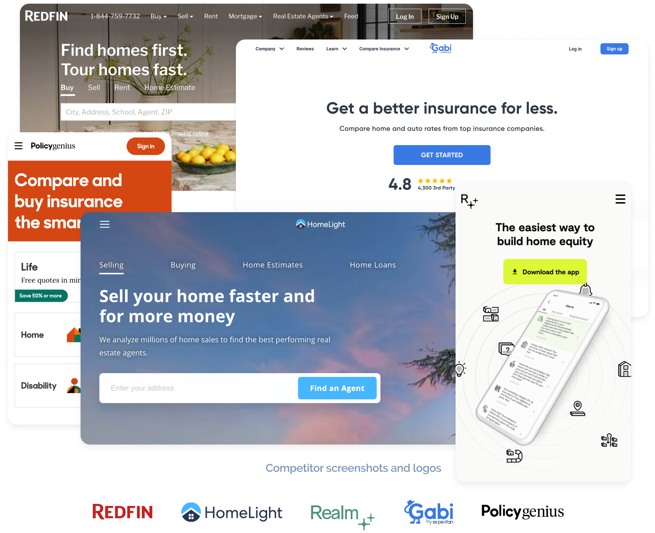
One of our USPs was AI-powered recommendations based on your part of the home buyer purchase. We added lines as a brand motif to show these connections between your information, home data (your phone), and our providers/services. Giving insight into your home when you need it the most. We also created a motion language by animating the lines coming out of one object and connecting to a service, or it would send a signal. These became particularly helpful during loading screens, turning waiting time into a small delight to the user.
Illustrations

We expanded our icons as full illustrations as we created more sections of the page and additional landing pages. The simple line illustrations with a slight pop of color helped simplify the home-buying process's complex concepts and provided a more flexible system to evolve the brand.
We were able to test these when we tried them in our commercials and social media; it drove more traffic than previous iterations.


Product Revamp
After the brand's launch, I worked on reskinning the old MVP and focused on new product features. I updated the first component library to match one to one the old product and kept adding as we expanded the capabilities.
From the first MVP, we learned which areas were being used the least, which offers users interacted with more, and which information they found most relevant. We took the learnings and applied them to the reskin to continue to improve.