
Background

While working at Lifetime Value Co, I had the opportunity to work on the creation of many of their brands. The one before was called NeighborWho.com, and it offered real estate public records. After seeing a crowd interested in online real estate and driven by their own experience as homeowners, the company owners wanted to invest in more related data, specifically online home valuations. The online home valuations market was growing; more customers already trusted other AVM (Automated Value Models, the software used to calculate the property value) providers like Zillow or more professional ones like Freddie Mac or Equifax.
The scope of the MVP was to add two free valuations, comparable data to the address, and historic values when available. And it was named Ownerly.

Research
We ran surveys to understand the motivations behind our target demographics better. Some key results mentioned that buying a house is an emotional experience and provides comfort and financial stability. We asked them how accurate the closing price was to the price listed online, and more than half said the value was close (34%) or exact (17%) to the price online, which led us to believe that people trust online values.
The concept presented focused on the house as a home, family-oriented and cozy—the idea of your house as a home, a place to store valuable moments. The team came up with the slogan "We know the real value of your home," a play between the actual home values and the value we add to our homes. We wanted to empower our users by giving them information to help them make better future decisions.
Landing Pages

Our first landing page was elementary, a search bar for the address with an image behind it. We wanted users to get to their estimates with less friction as possible. Competitor research for color and photography revealed that house images and color were standard in most sites, and colors like green, blue, and red were most common across.
Because it was part of our concept, we included a family for our first landing page. Quickly after, we started testing just images of houses like our competitors, and finally, we tried even a simpler version with illustrations which ended up being the winner.

UI Kit
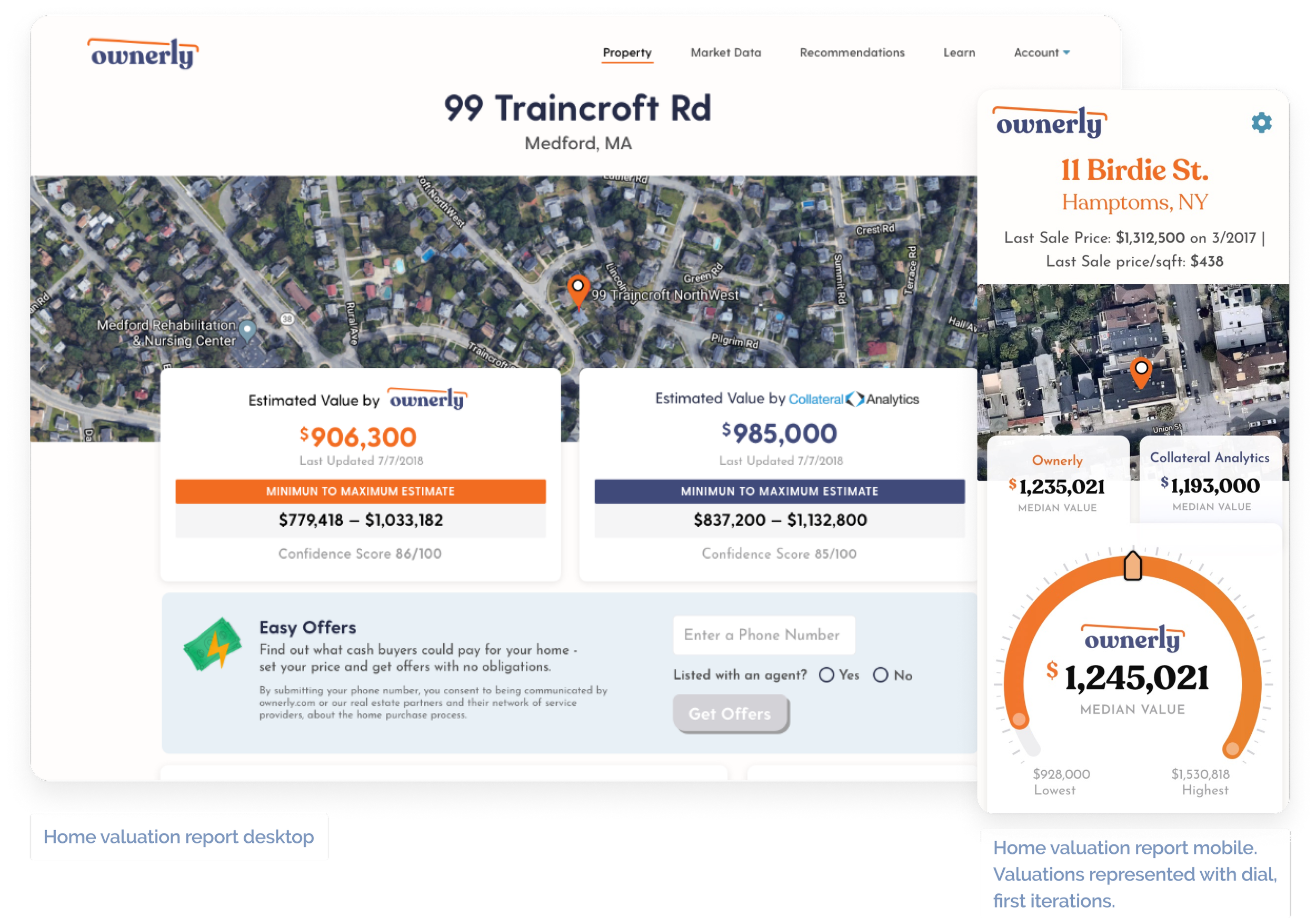
I worked closely with the product designer and product manager to create a basic layout for the valuation reports. The reports included the property address, two valuations, comparable data, and historical values.
The report's main focus was the home estimates, so we wanted them to be easy to understand. We receive three numbers from the data providers: a range, an appraisal, and a confidence score. The estimate we show is not the exact price but the most likely price within a range, like a bell curve. What is the confidence score? This number is calculated based on how far apart the prices are; the more the range, the lower the accuracy score, and the shorter the difference between them, the more accurate that price is. One of our early challenges was to represent this visually. The main stakeholders wanted to display as a dial, like credit karma credit score. We tried out the idea, but after testing, we failed to convey that it was a range. The product designer and I worked on other solutions for an A/B test, displaying the estimated price as the most significant with the price range and confidence score below.
The rest of the report was modular, with different data tables and content inside boxes; this aided the devs and designers in easily swapping sections for testing and adding data.

Illustrations
As we expanded the brand to secondary pages and added to the search flow, the need for illustration increased. We added more graphics on the about pages and partner pages.
I also worked closely with the media team to create illustrations for a commercial, which saved the company post-production time and production money.
We included illustrations in our social media and web ads, steadily increasing engagement and click-through rates.
Optimizing the flow

As part of the SEO team, we constantly tested new approaches to engaging customers to buy our services. Initially, the search flow was straightforward; we went from searching for an address to creating an account to displaying the free home estimates, but we wanted to improve upon it.
In past tests, we learned that the more a user spends invested in a signup process, the more likely they will convert (if they don't leave halfway). A personalized flow was an opportunity to improve our leads' quality and value, get to know our users better, and cater the experience to them.
We produced a question flow that felt conversational and engaging for the user, switching from simple yes/no and multiple selection questions to loading animations that showcased the brand motif, icon sets, and illustrations. We tested different orders and amounts of questions, added and removed services, and kept iterating, looking for a balance between our users' and partners' feedback. We managed to improve our user engagement and conversion and the quality of our leads following the launch and iterations of the new flow.